5K
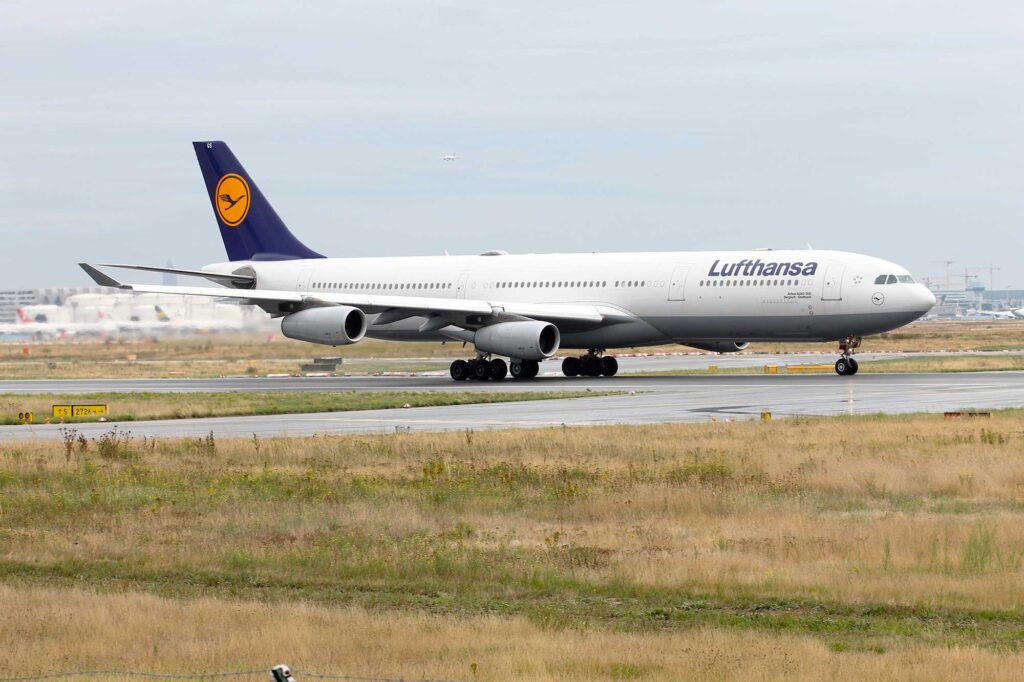
When an airline changes its livery and corporate branding, it usually causes mixed views from among the aviation enthusiast community and loyal customers.
It seems that over time we get used to new liveries and often forget what they used to look like. But sometimes it’s hard to forget.

In this example, we look at Lufthansa, which first revealed its new livery in early 2018. It lost the familiar yellow crane logo, becoming simply blue and white (or is it silver?).


Which do you prefer? Leave a comment below.


12 comments
i’m afraid the new livery is dare i say Dull.
bring back the old livery which we all love
I agree with Keith ! The new livery is so dull especially for Germany when you have 5 months of grey skies and you cannot see anymore the plane as it is dark blue ! Miss the the yellow color which was so lively and sunny for my heart!
Prefer the old but if the new one had some yellow highlights, in keeping with LH tradition, that would have improved the new livery in my opinion.
Old livery for sure! I love the grey belly and yellow. Especially on the 747.
Yes the old livery needed an upgrade but losing the gold/yellow colour for a dull corporate style is a big mistake. They are now just part of the pack instead of ‘above the rest’.
The new livery needs the yellow.
I too prefer the old scheme, the new one is rather drab
No question at all, the old colour by a mile for sure.
Come on LH, change them all back !
I like the new livery better than the old
Old livery for sure, the new one is very dull in my opinion.
Don’t want to upset anyone but I think new livery has more style. Gives the impression of up market product
NEW COLOURS ARE TO MUCH LIKE TAROMS COLOURS A BIG MISTAKE IF YOU ASK ME