8.3K

When an airline changes its livery and corporate branding, it usually causes mixed views from among the aviation enthusiast community and loyal customers.
It seems that over time we get used to new liveries and often forget what they used to look like. But sometimes it’s hard to forget.
In our first example, we look at American Airlines.

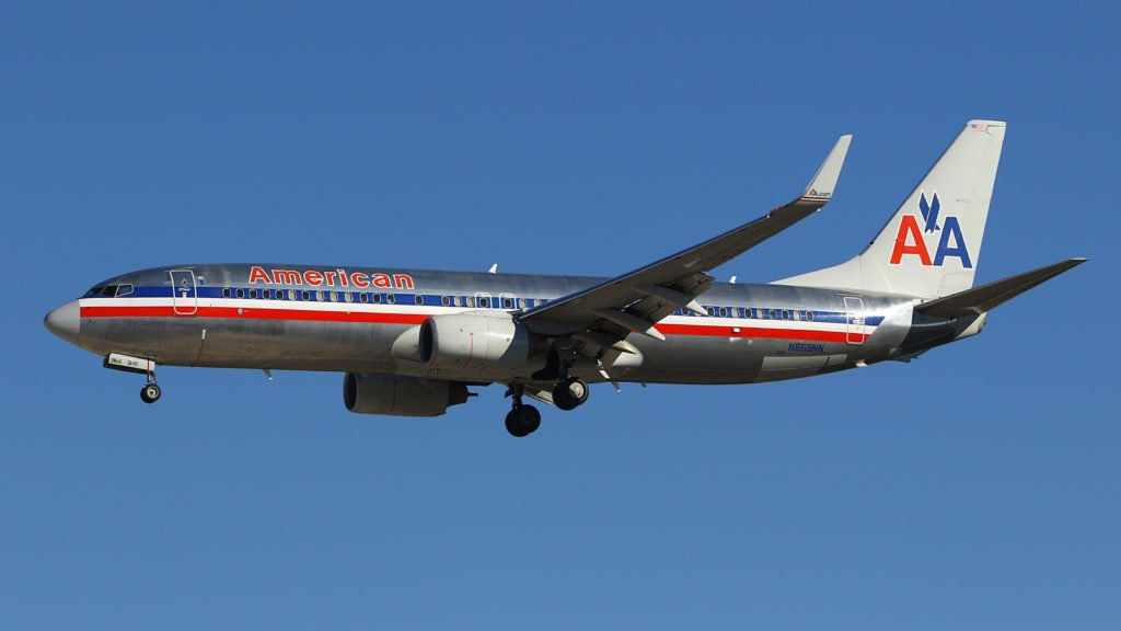
N869NN at Las Vegas. Photo (c) Erik Ritterbach
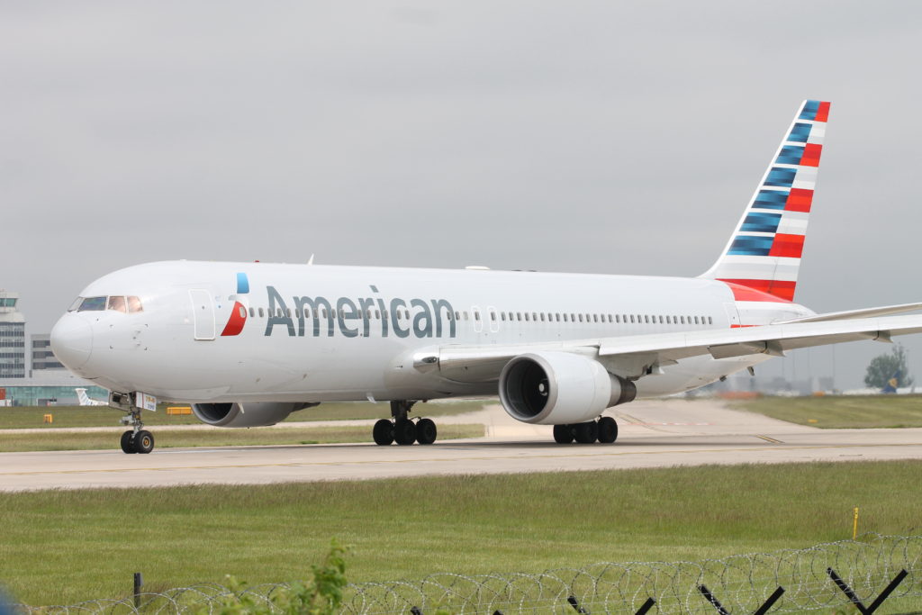
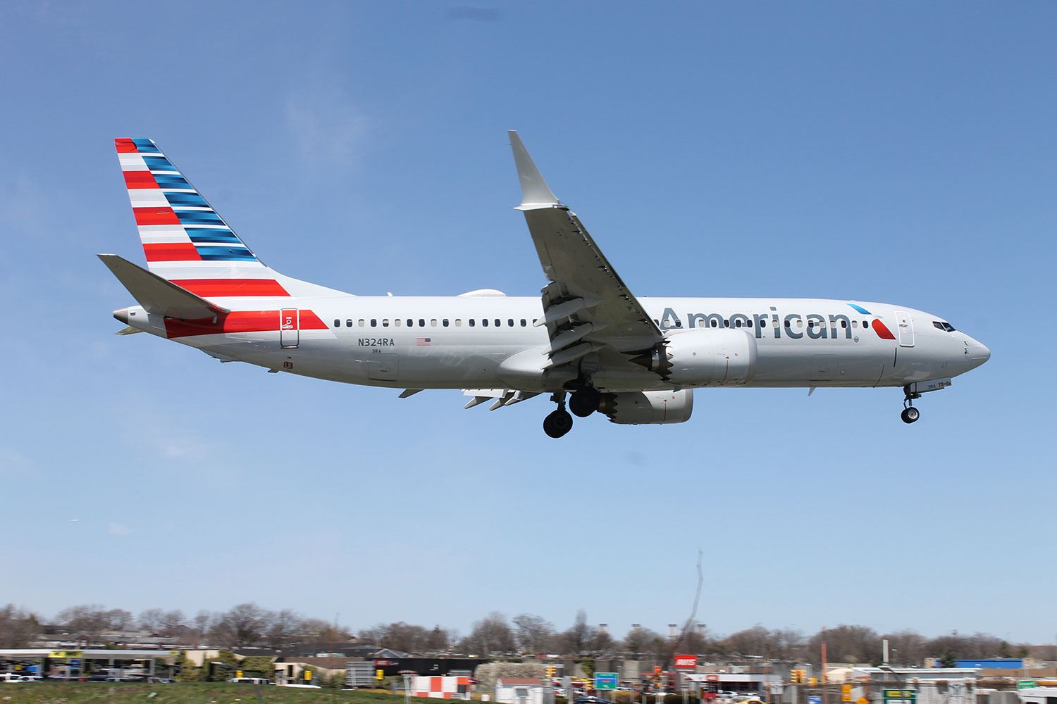
Beginning in 2013, the classic polished metal look started to be replaced by a painted light grey and updated tail livery.

Which do you prefer? Leave a comment below.


21 comments
My preferred choice would be the original silver polished body combined with the striped tail.
The old, definitely
Very few recent livery changes have been for the better. Aegean is one of the few, but its old livery was dire beyond belief. KLM’s was good until it introduced that needless ‘swoop’ line. United’s is worse than it was. Alitalia’s and Flybe’s speak volumes for their management..,’we’re dead in the water…let’s fritter away money on a new livery’.
The chrome
I prefer the classic polished metal. My understanding is they had an employee vote with a very narrow margin going to the new look.
I like the classic look.
But if I could but them togather, the classic polished metal look with the updated tail livery would look great I think.
Interesting idea Brad!
Although I’m normally a traditionalist, and enjoy seeing retro schemes, I actually prefer the new American Airlines scheme. Unlike a lot of today’s carriers, there is plenty of colour and it comes across as much cleaner looking.
The classic bare metal — by far.
The old especially the double A on the tail. Seems like the airlines waste so much money changing the livery for something that looks worse.
Although the new one is slowly growing on me, I think the old is much better and certainly more photogenic.
I share the Brad’s opinion. This almost generalized tendency to keep a white fuselage and put some distinctive elements/colors just in the tail, is not so original. Keeping a part Alitalia’s problems (I’m Italian), I’m a frequent flyer of Lufthansa but the option of that dark blue tail without the iconic yellow crane, reveals a total lack of fantasy.
Old livery for sure, especially on the 757-200’s. Not a big fan of the new livery.
You can’t beat the original, unpainted finish. It was distinctive enough to make American Airlines really stand out in the crowd. I’m not saying the current scheme is easily lost but it’s just paint, whereas the unpainted and polished look had real class.
Split loyalties on this one. As an aircraft spotter , the new scheme makes it easier to read the aircraft registrations. With the old scheme this could be difficult especially in some light conditions. On balance , I prefer the new scheme. Often the simplest of schemes are the best. You don’t have to remind me of the United /Continental scheme after they merged. The “new” United scheme is much better.
Great point about the registrations, Adrian! The numbers on the old polished livery were really hard to read.
Old livery all the way!!
The livery was changed due to the carbon fiber aircraft unable to mimic the original chrome. It’s sad that new technology basically “forced” their hand so that all aircraft would look the same. Having said this, the new look is growing on me. The new tail, is actually my favorite part of the scheme.
The chrome. I grew up with it while my Dad worked for American.
Whilst I like the new American Airlines lively ,I do prefer the old livery
I actually prefer the pre-1968 liveries with the orangish-red lightning bolt. The 1968-2013 livery looks like Amtrak’s Phase III scheme, but not.
POLISHED SILVER:
I grew up with the silver livery, so when I saw them change the look in 2013 (I was 23 at the time), I was not happy. Now I really like it, but will always love the silver.